There are a lot of things about website design you may hear, as far as terminology goes. Of course, there are the standard terms – SEO, for search engine optimization, blogs and blogging, HTML, and so on – but then there are vaguely unfamiliar ones you might come across, such as in today’s case, responsive design.
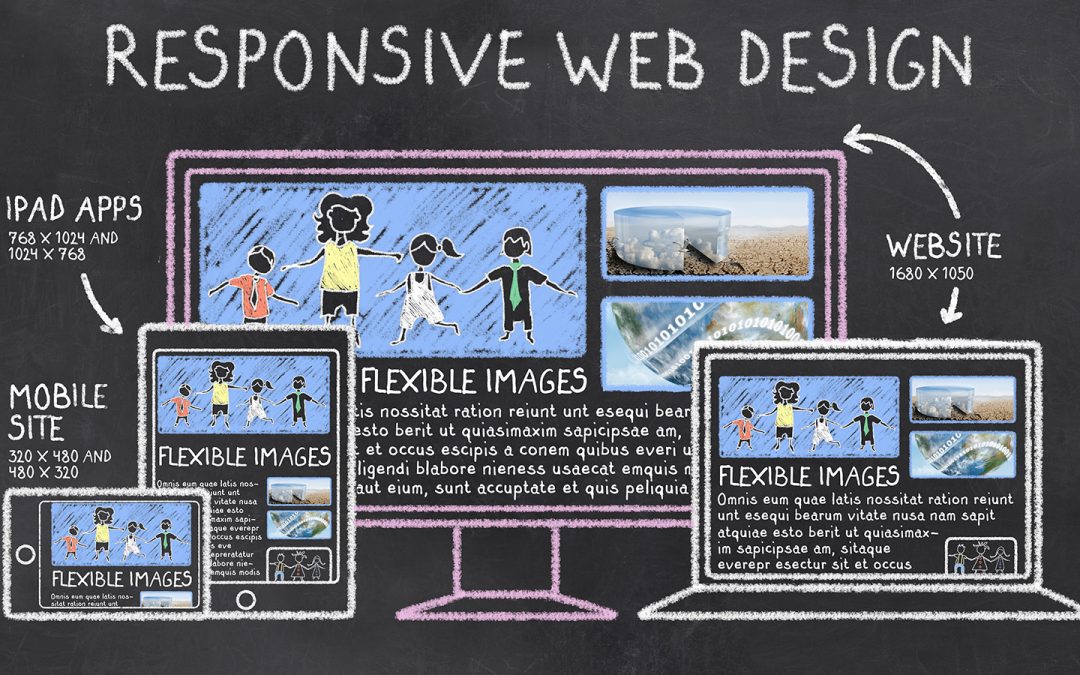
This is the basic definition of what responsive design actually is, according to the one outlined by SmallBizTrends.com: “Responsive Web design (RWD) is a Web design approach aimed at crafting sites to provide an optimal viewing experience—easy reading and navigation with a minimum of resizing, panning, and scrolling—across a wide range of devices.”
This sounds simple enough, but have you ever wondered why you should have responsive design in addition to what exactly it is? If you’re still trying to understand, don’t worry, we’re here to help. Let’s go over together what responsive design is used for and whether or not those recommendations for getting it are sound advice.
What is Responsive Design Used For?
In most cases, this form of website design is used for the most obvious reason – to respond to you. It is primarily used for websites applicable to being used on mobile phones, smartphones, and tablets – hence the name. So instead of navigating around on a website with the click of a mouse on a desktop computer, you’re navigating websites straight from your fingertips, bringing your products or services directly to the customer – even when they’re away from their computer.
With mobile phones being tweaked and reprogrammed to adapt to today’s technology more frequently, it seems natural to use a responsive design for your website, especially if you want your company to get into mobile marketing. How you want the design to be presented depends on the content you want to feature. On mobile phones it’s best to display your content in single columns of text, whereas tablets are more flexible enough to feature two columns of text.
What’s the Point?
The point is to have one website, but it also must have several other aspects that allow it to respond differently depending on the type of device being used. The latest study on mobile marketing found that 51% of users are spending more time on their mobile devices over computers, and even now tons of big-name companies and social media giants such as Twitter have already been making the effort to bring their services directly to those who use it daily.
The key thing to understand is that design-wise, they are similar yet different. The main difference is that responsive design needs to be simpler than a desktop website. Given how small a mobile phone’s screen is compared to a computer’s, size and navigation-friendliness are the main features that can either make or break a website’s design. You don’t want to clutter your home page with images, for instance, and a slideshow is less likely to show up properly on a mobile phone or tablet compared to your regular website on the computer. Loading times matter too, as 30% of people tend to only wait 6-10 seconds for a website to load on their phone before moving away from it.
Another key point is that responsive design is preferred for SEO. Having only one URL makes it easier for search engines to spider and catalogue your content as well as reducing any possibility of on-page SEO errors. Responsively designed sites just usually perform better and are easier to maintain than multiple sites for desktop and mobile users.
Do I REALLY Need Responsive Design…?
Let’s put it this way: yes. The trend is simple – mobile computing is growing at a very rapid rate and more users will be viewing your website on a mobile device or tablet. It doesn’t stop there though – remember that responsive design will also adjust to varying sizes of displays on desktops and laptops as well. Responsive design also adapts to future devices and displays that we haven’t seen yet.
You should also keep in mind that earlier this year, Google rolled out if mobile-friendly algorithm. This means that if your site is not responsive or fully mobile capable, your search rankings may drop drastically for any searches done on a mobile device or tablet.
If it’s time to upgrade your site to responsive design or you want to make sure that your site is designed properly in the first place, contact us at V3 Media. All of our sites are 100% fully responsive.